This project reinvigorates a cornerstone brand
in the world of printing.
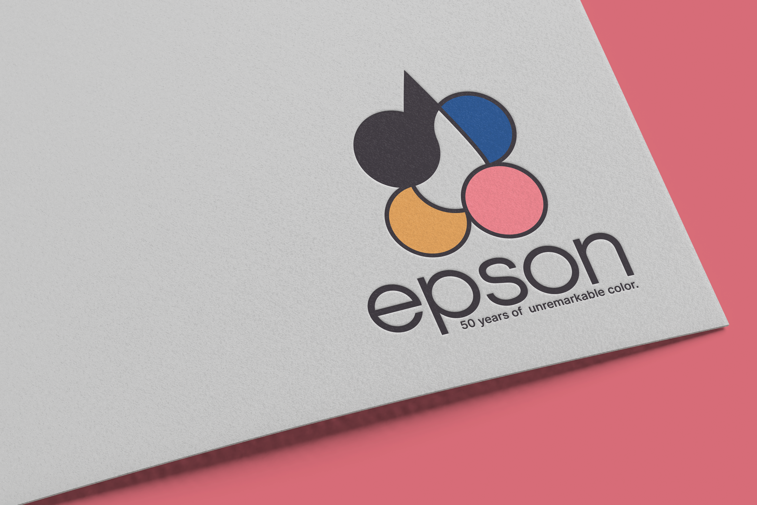
Since 1975, EPSON has been an intuitive brand reinventing precision. Throughout those 50 years the EPSON brand logo has varied slightly, but largely stayed the same. This rebrand aims to put life and excitement back into the historic company


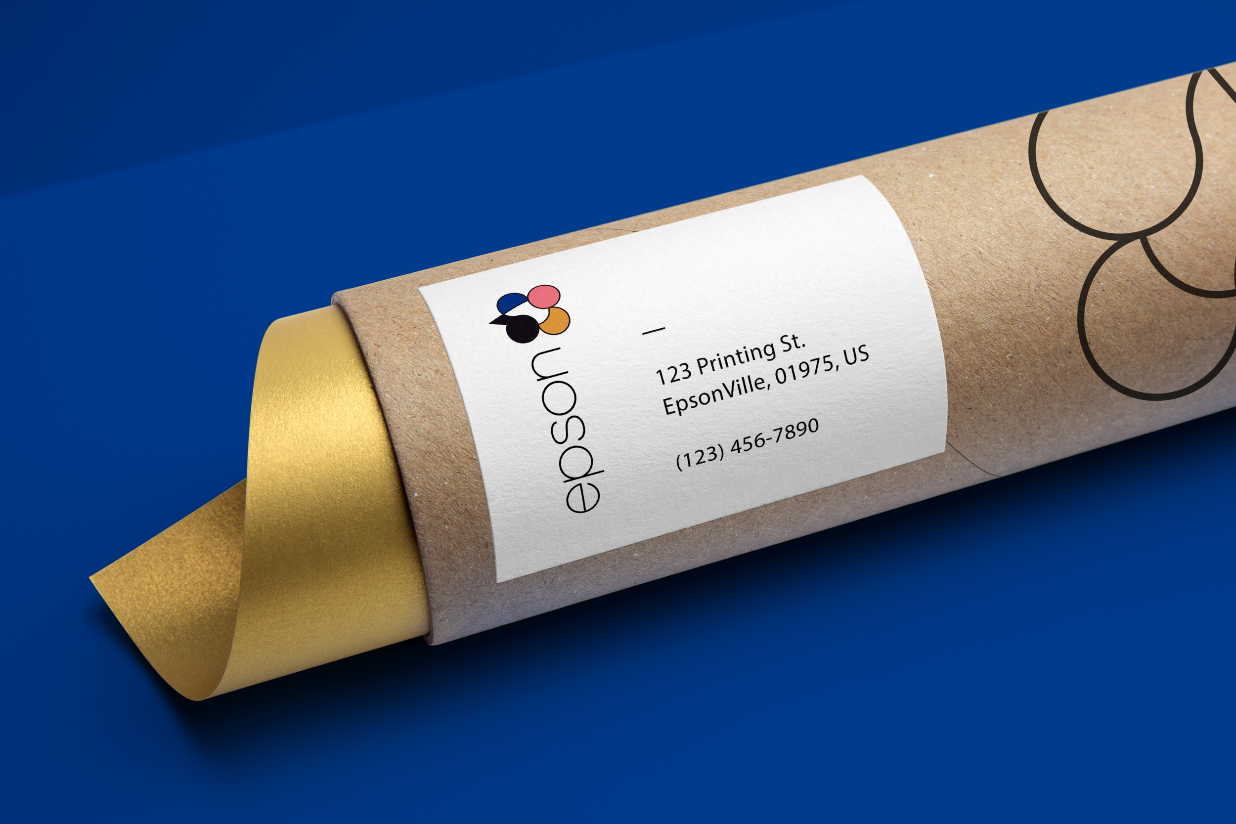
Grounded in vibrant color and technological innovation, EPSON should highlight beauty of traditional print media. Adding a simple and elegant logomark gives the opportunity to highlight process colors and nod to the inkjet printing process.
The focus of this project was to reinvigorate the brand with the passion and excitement of what physical print media can be. EPSON isn’t about gears and cogs, EPSON is about creativity and passion.


